Sunday, July 3, 2016

Big Picture July 3 2016: Gold to the Moon


The big picture Daily chart for Gold simply awesome showing the beginning of an uptrend cycle that could last into the 1600 range and beyond quite conceivably eventually returning to 1900.   The daily chart below showing the break out emerging cracking past the upper bound of the purple chaos indicator curves, there will likely be couple of different opportunities to get on board over the course of the remainder of the year as it builds a platform in the 1320-1400 range before zooming up.


Big Picture: S&P status July 3 2016

The probability that S&P would head down to 1500 did not materialize obviously however it did get down to 1800, before turning around.  Though the depth of the fall was not as deep as anticipated, the subsequent turn-around and climb back up pattern matches the general pattern seen in the smaller time frame oil charts in the previous posts, where price climbs all the way back up to previous levels.

See chart below 521 minute ES with several different chaos indicator curves, it is rather clear why the  turn-around from 1800 was not surprising.  The recent Brexit spike down is also seen in this chart, and obvious there is the support green chaos indicator line at 2013.06


The question now of course is where to next?   Consider the daily ES chart and the smaller 123 minute ES chart captures the pattern.  It suggests some bullish shaped side-ways movement and a subsequent fall is in the works.  ES could move up to the 2150 even 2170 range prior to taking a turn back down to the 1980 range.  It looks like upward movement that is essentially works out to side-way and then falls back down, the key thing is that it is very unlikely to exceed 2180, that would be the absolute top for the rest of the year, and it may not even get there and start heading down.   The initial downward slide target would be something like the 1980s or 2000 range.  The time-frame for all these is the rest of the current year to early next year.  It would be very surprising if it moved past 2180 and kept going on upwards would be extraordinary and unexpected.  The pattern is evident in the 123 minute ES from the past market action on that chart.


Monday, January 11, 2016

Big Picture: S&P Falling to 1550?

The EMINI S&P ES setting up nicely with a very classic pattern in the first couple of weeks of January 2016.  Why classic?   Is this something seen before?   Absolutely yes    Market price charts are quite fractal like, so smaller time-frames charts exhibit the same patterns that larger time-frame charts do and these patterns become much more clearer when viewed under the chaos indicators lens.

Consider the ES EMINI chart on Monday night January 11 2016, in particular note the exact placement of various lines, in particular the wave-trend current high (yellow blob) in relation to the various intersections and positions of the other lines.


Next consider a smaller time-frame chart that exhibits a very similar pattern to the above chart - this is the 199 tick (roughly 3 minute) oil CL chart from a year and half ago - this type of pattern can be found in any time-frame chart really - again - think self-similarity - fractals - it is the same behaviors over and over again across time-frames and even chart types-


It is evident here in this oil chart that the price comes down to meet the gray curve with wave-trend blue dots firing off.  And that intersection point roughly corresponds to the price level that the red curve intersects the white vertical line on the left side.    In the ES EMINI chart the red curve intersecting the white vertical is roughly 1550.   Notice how the oil CL went on to gain back everything it had lost after reaching that bottom there at the 91.60    The 91.60 on this CL oil chart corresponds to the 1550 on the ES daily chart above.

Are there any other possibilities with this current ES E-Mini set-up?   There are some deep crash scenarios that show some similarity to it where it could crash well below 1500   However the set-up could lead to magnificent/stunning upswings as well down the road, again based on self-similarity with very small time-frames.  Some CL oil smaller time-frame charts to consider below showing some possible variations how this set-up could run its course


Sunday, September 6, 2015

Big Picture: DOW JONES the 9999 Red Line Support

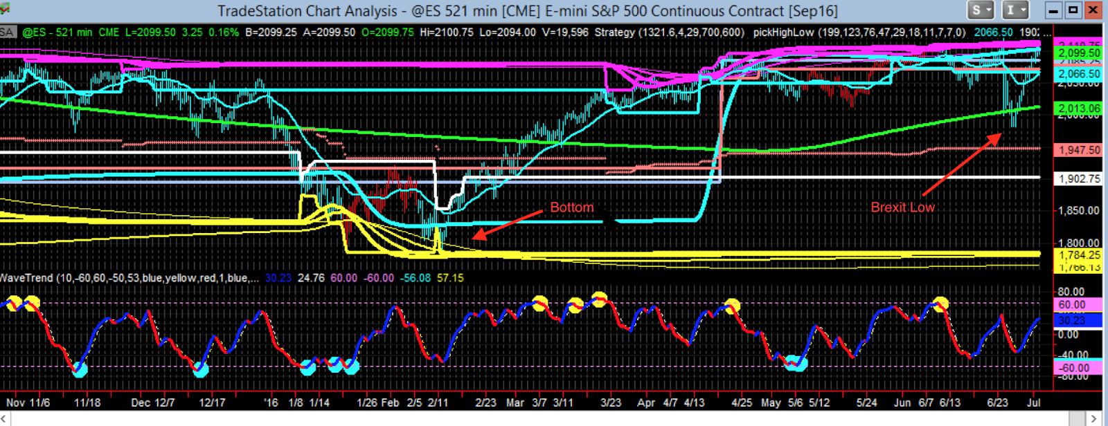
Some of the big picture posts earlier in this blog anticipated the downward movements in the S&P because the structures were looking extremely similar to the 2008 event, in fact these structures repeat all the time in small time-frame trading.   Markets are very fractal like the larger time-frames are exactly like the small-time frames so there is no surprises at all really and can be anticipated if one studies the smaller time-frames and looks for similarities in the larger time-frame.

While nothing special can be said about the current S&P big picture chart, something very interesting is going on in the DOW Weekly.   Note the Red-line in the below DOW chart is at 9999 and there is this wide gap between the Purple and Red lines.  Purple is the top line at 18351   In structures like these, where there is this distance between the Purple and Red lines, in smaller time-frames like intra-day charts the often the price moves all the way down to the Red line.  Not every single time but more often than not.  After touching that Red line it bounces up from there is a common pattern.  Which raises the structural prospect in the larger Weekly time-frame of the DOW working itself to 9999 is very much in the cards and should not be surprising.  The other possibility is that it will move all the way back up to and beyond the purple line, dragging the Red line upwards with it eventually cannot be ruled out either but though that can happen, it is less often the case in smaller time-frames.

Thus the possibility exists, and should be taken seriously, that the DOW may travel all the way back down to the Red line which is in this case interesting value 9999   Is there an occult numerological significance to this is not clear am not a believer in such things but it is striking that the Red line is at 9999 somehow, why was it not 9958?   Why is it exactly 9999 - that's just how the chaos calculation fell out for the Red line, the Chaos Levels Indicator's algorithm computed that, it is not something placed there artificially - in fact that level was established years ago in the Weekly Chart Chaos Level computation - on precisely end of week 12/31/2004 - is remarkable that it was the last week of 2004


Sunday, August 23, 2015

Big Picture: CL Crude Oil where will it stop falling?

Oil CL is so awesome for day trading that one often completely neglects that it is great for swing trading as well or even long term trading with large profitable moves very much in the cards.   Of course in the recent year it has fallen sharply and continues to fall.   So where might a support area be that might permit a reversal trend swing trade?  

Incorporating the remarkable Jurik JMA into the various Chaos indicators yields some great signals, to illustrate consider the following chart that provides a very early indication of the support area - that spot at $38.00 is where one should definitely cover any shorts (sell any puts) and seriously consider going long.  Sometimes price action penetrates the support by a bit and turns back up through the support, that may very well occur here but in either case that area around 38 is an excellent spot for reversal zone plays.   It could of course simply rip right through it and fall below that as well but that is less likely due to the distance between the purple line up top (which is still at $109) - rather it will likely turn around at 38 and head back up some is in the cards, enough at least to pull the purple line down from its lofty heights.    In any case the conservative course of action is not necessarily to go long there at 38 but one must definitely exit any short position once price reaches there is prudent.  And then to consider a long after that would be the swing trading plan.

Notice how extremely early the support was apparent with this indicator, it was obvious when CL was trading in the $60 range!  


Friday, July 31, 2015

On-Going Research: Meta-Systems with Customized Trading

As one observes these chaos systems especially the Tick systems, it becomes apparent that their performance curves are actually showing something about market structures.   If a performance curve of these systems is dipping, then that says something about real market states and if the performance curve is doing well then that shows something too.  

Because there is a correlation between the algorithm performance curve and market states, what if one were to try and take the performance curve itself as an input for a "meta" trading system?   In its simplest form one could literally plot a moving average lines of the performance curve and trade only when there are positive crossovers!   Or graph a channel taking trades with a system only when its performance curve is inside a channel    Technical analysis not on the market but on the performance curves of systems trading the market is the idea.  

There is actually one technical indicators vendor, Customized Trading www.customizedtrading.com  that provides Tradestation OOEL strategies to precisely this sort of technical analysis on existing system performance curves and trade them only when things are looking good    This can significantly reduce drawdowns and enhance a nice system into a really nice system

The OOEL Equity Switcher Strategy available here: http://www.customizedtrading.com/ooel/trade-equity-curve     And the process of experimenting with it to improve Chaos Tick systems is in progress.  

Possible Inaccuracy in the Minute Systems Hypotheticals?

All the Minute systems discussed in other blog posts incorporate Break-Even stops of relatively smaller tick size   There could be an issue with Tradestation back-tests on higher time-frame minute charts the "resolution" level might not be accurate enough to correctly process such lower amount break-even stops.  

This raises some troubling questions about the accuracy of the Minute systems back-testing results even though look rather outstanding they are much less impressive without the break-even stops.   This issue can be resolved by trading one or more of the Minute systems and compare the two sets of results, because even if the back-test resolution is not that great the important thing is how the Tradestation processes the system under real-trading conditions- as long as it continues to behave in the same way in the back-test, with poor resolution in real-trading all would be good.

So at some stage shall start trading the Minute systems myself in my own account regularly to settle the matter but for the time-being am knee deep in new Tick systems and Meta-systems being built on top of Underlying systems that have no real room for experimenting with the Minute systems   The underlying algorithm is the same as the tick ones but the time-frames and Tradestation inaccuracy in the minute hypotheticals is food for thought.