Sunday, July 3, 2016

Big Picture July 3 2016: Gold to the Moon


The big picture Daily chart for Gold simply awesome showing the beginning of an uptrend cycle that could last into the 1600 range and beyond quite conceivably eventually returning to 1900.   The daily chart below showing the break out emerging cracking past the upper bound of the purple chaos indicator curves, there will likely be couple of different opportunities to get on board over the course of the remainder of the year as it builds a platform in the 1320-1400 range before zooming up.


Big Picture: S&P status July 3 2016

The probability that S&P would head down to 1500 did not materialize obviously however it did get down to 1800, before turning around.  Though the depth of the fall was not as deep as anticipated, the subsequent turn-around and climb back up pattern matches the general pattern seen in the smaller time frame oil charts in the previous posts, where price climbs all the way back up to previous levels.

See chart below 521 minute ES with several different chaos indicator curves, it is rather clear why the  turn-around from 1800 was not surprising.  The recent Brexit spike down is also seen in this chart, and obvious there is the support green chaos indicator line at 2013.06


The question now of course is where to next?   Consider the daily ES chart and the smaller 123 minute ES chart captures the pattern.  It suggests some bullish shaped side-ways movement and a subsequent fall is in the works.  ES could move up to the 2150 even 2170 range prior to taking a turn back down to the 1980 range.  It looks like upward movement that is essentially works out to side-way and then falls back down, the key thing is that it is very unlikely to exceed 2180, that would be the absolute top for the rest of the year, and it may not even get there and start heading down.   The initial downward slide target would be something like the 1980s or 2000 range.  The time-frame for all these is the rest of the current year to early next year.  It would be very surprising if it moved past 2180 and kept going on upwards would be extraordinary and unexpected.  The pattern is evident in the 123 minute ES from the past market action on that chart.


Monday, January 11, 2016

Big Picture: S&P Falling to 1550?

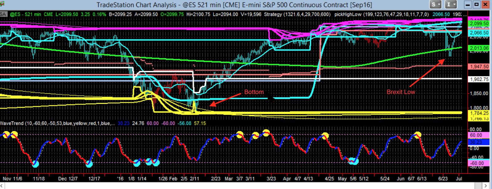
The EMINI S&P ES setting up nicely with a very classic pattern in the first couple of weeks of January 2016.  Why classic?   Is this something seen before?   Absolutely yes    Market price charts are quite fractal like, so smaller time-frames charts exhibit the same patterns that larger time-frame charts do and these patterns become much more clearer when viewed under the chaos indicators lens.

Consider the ES EMINI chart on Monday night January 11 2016, in particular note the exact placement of various lines, in particular the wave-trend current high (yellow blob) in relation to the various intersections and positions of the other lines.


Next consider a smaller time-frame chart that exhibits a very similar pattern to the above chart - this is the 199 tick (roughly 3 minute) oil CL chart from a year and half ago - this type of pattern can be found in any time-frame chart really - again - think self-similarity - fractals - it is the same behaviors over and over again across time-frames and even chart types-


It is evident here in this oil chart that the price comes down to meet the gray curve with wave-trend blue dots firing off.  And that intersection point roughly corresponds to the price level that the red curve intersects the white vertical line on the left side.    In the ES EMINI chart the red curve intersecting the white vertical is roughly 1550.   Notice how the oil CL went on to gain back everything it had lost after reaching that bottom there at the 91.60    The 91.60 on this CL oil chart corresponds to the 1550 on the ES daily chart above.

Are there any other possibilities with this current ES E-Mini set-up?   There are some deep crash scenarios that show some similarity to it where it could crash well below 1500   However the set-up could lead to magnificent/stunning upswings as well down the road, again based on self-similarity with very small time-frames.  Some CL oil smaller time-frame charts to consider below showing some possible variations how this set-up could run its course